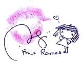
It seems like I'm not really satisfy with my yesterday's drawing I did for the header. So I made the new one which looks like fit enough with its position as a header. I also coded everything and change almost everything (but it doesn't look so obvious, unless you are my hardcore blog reader).
Look at the sketch! The ribbon wasn't on her bite thus showing her lips and nose (ugly). Luckily the end result was really-really stunning! Thanks for the support everyone!
I don't know but so far I'm happy now (because I am mostly envy with your blog designs out there and the funny thing is I'm a web designer!). So I've tried my best to design everything so I won't feel that way. Well, we'll see how long I will be happy with how it look as now. Enjoy!

 Click to join my contest!


4 comments:
best laa jd u...creative! love to see them, ur artwork!
kan best leh lukis header sendirik camni! faa xreti..
Thanks dear...practice makes perfect..klu faa minat,ble asah bakat perlahan2! <3 good luck!
comel! cantik ni header.. sy suka yg pakai bear hood ni.. kiut! ;)
thanks nowriz! <3
Post a Comment